Logo & Brand
Working with major brands demands that we, as designers, can adhere to the constraints of preexisting guidelines while simultaneously doing something unique.
Interestingly, the limits set forth in a brand guide largely expedite the work. There is less need for exploration and experimentation, clarifying the objective and measurable success metrics of the project a more achievable challenge.
While I would not argue my identity and brand work are not necessarily my core strengths, my capacity to perform in that role is something I thought I’d share.
These are original logo and brand explorations.


Branding for a Balloon Stylist
Growing up in the northern United States, there are several things I was blissfully unaware of. For example, I didn’t know collard greens were a thing, and that grits could be made savory-style, with shrimp and cheese. I was also unaware of the balloon arch thing, and that party decorations of a certain style were very popular in Mexico and Texas, as well as any region where there is a substantial hispanic population.
This logo gets a lot of attention and positive feedback. The stylist uses this for social media, on business cards and signage, and as stickers to acquire new business.


A Look for a Boutique Design Studio
I don’t have an Llc, but if I were to, I might set up a brand like this. To “take the high road” has several meanings, including “a way of competing successfully in business by emphasizing employee needs, such as training, good pay, and good working conditions..” It also captures a method for choosing a clearer and easier route toward a destination; one that affords visibility and averts risk. It’s also used to suggest going forth doing what is moral or most correct and which is least likely to harm or upset other people.
No matter how it might be taken, HiRoad is a brand I was tinkering with.


Saplings for a Landscaper
A landscaping worker was tossing around the option to split off his own landscaping company and wanted to see what a logo and other material could look like.
The client was essentially he and his wife, and they really wanted to emphasize their botanical understanding with the differentiator being the design of beautiful, often floral spaces, hence the “green thumb” motif. They liked and approved what is animated.
They never did get the business started. In fact, he became a general contractor, focusing on electrician work and gets to work inside more. It is Cleveland after all.


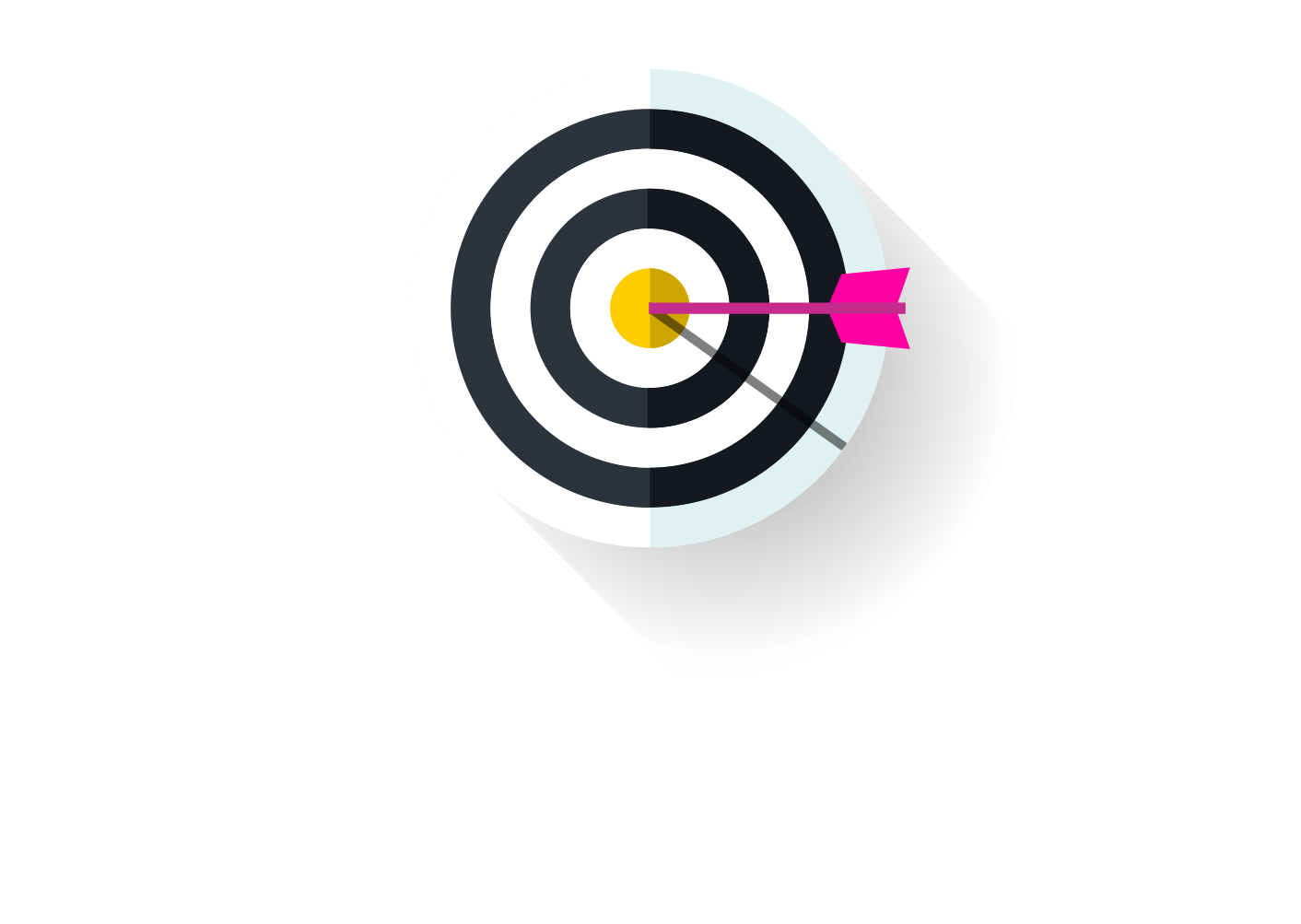
For what it’s worth, we beat that goal by a few hundred thousand and this logo was part of the strategy for a contest campaign we ran as part of that effort.
A Delta Air Lines Contest Logo
One of the challenges Delta had for our team at Razorfish was to grow their Facebook fan likes from one to two million in the course of a year.