Marketing & Media
Marketing work brings a refreshing dimension to design. While creating for user experience is fulfilling, marketing demands a unique balance of psychology, sociology, strategy, and creative experimentation.
Add data, analytics, evolving platforms, shifting demographics, and the constant dance of culture and technology to the mix, and the result can feel as complex as it is exciting.
Or, maybe we’re just making cool stuff and discovering what resonates…
Below is a selection of my marketing work.
GT’s Kombucha Campaign
As the Creative Manager at Under Armour, I led a team that helped marketing partners message audiences within the UA ecosystem, which would include MapMyRun and MyFitnessPal apps and web pages, along with Sponsored Challenge experiences
One of my responsibilities was to support account teams to ensure program metrics brought meaningful ROI to our partners. When GT’s Living Foods initiated a 30-day campaign on the platforms, our AM partners saw less-than-optimal performance data and brought us an opportunity to optimize the campaign.
While the campaign was trending in the right direction, the implementation of more focused, interactive, and animated media placements optimized performance and yielded increases in MyFitnessPal diary entries for GT’s Kombucha, which can be inferred as sales.
Diagnosing the problem
Originally, our client sent over creative made by their agency partner. Some clients were more receptive than others when it came to re-imagining their campaigns, and in this case, GT’s was open to ideas.
Our analysis: When examining the media and the performance, our initial diagnosis was that the placements were too static, and the messaging was tailored to too broad of an audience. The UA user is active, and interested in fitness and nutrition, and that innate understanding of the demographic presented opportunities for direct and meaningful connections if the visuals and messaging are more precise.
Proposed Alternative #1
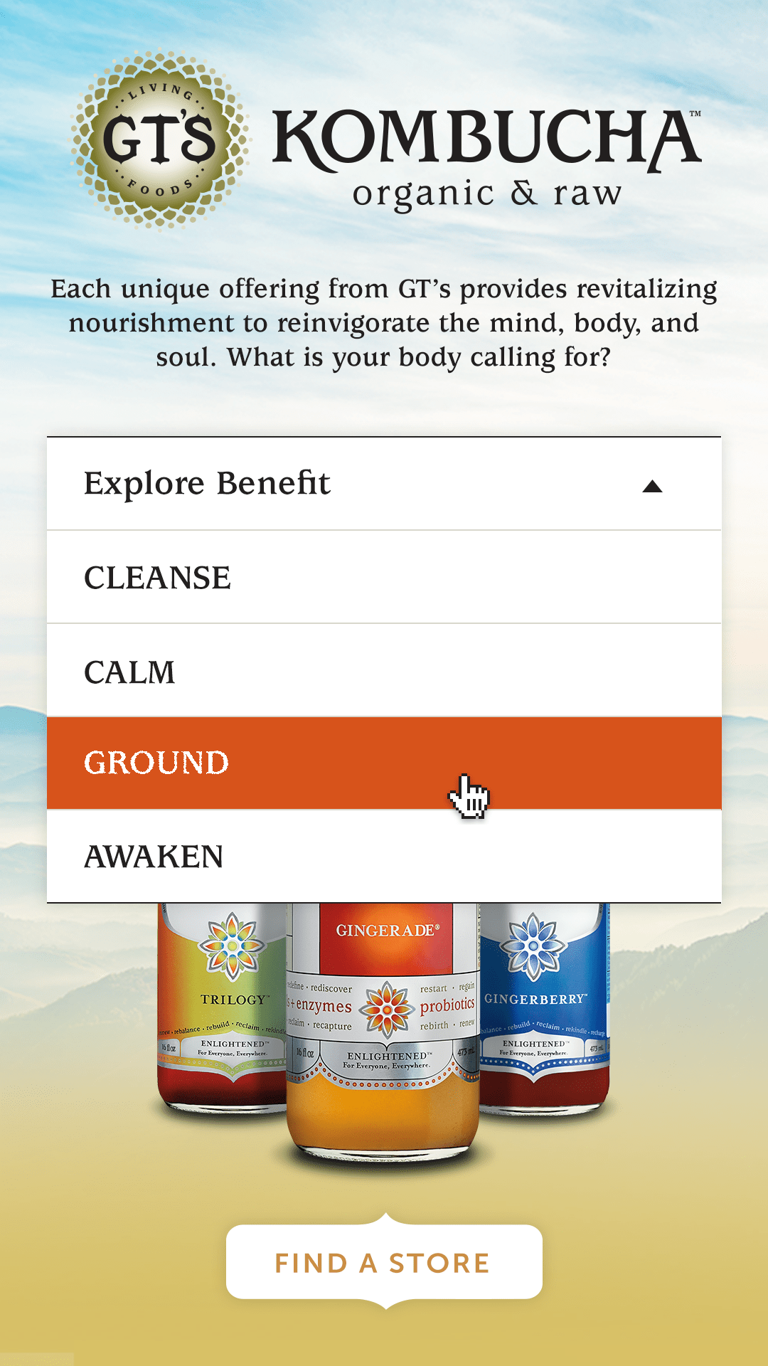
In this concept, we wanted to quickly introduce the brand and quickly allow users to explore the health benefits of each of the varieties.
Ultimately, we stripped the ability to select a flavor and ran separate placements for each flavor.
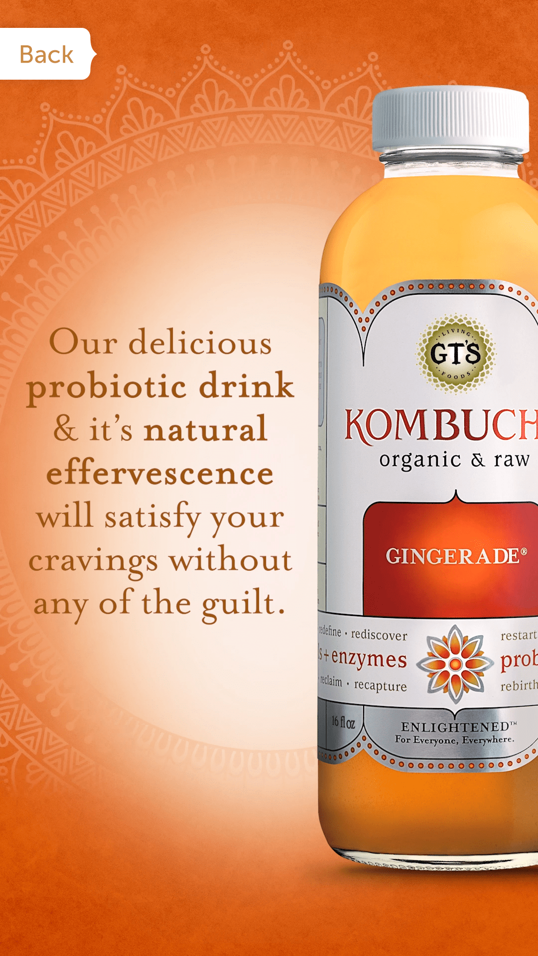
We were able to introduce animation and motion design, which is always more captivating when communicating to the audience, and as you’ll see in the forthcoming results, this is likely a key factor in performance increases.
Proposed Alternative #2
The MyFitnessPal audience was distinctly interested in fitness, snd more broadly, diet, nutrition, and meal planning. When researching the client, we discovered they had mouth-watering recipes that used their products as ingredients along with terrific photography.
The team and I selected several recipes for an interactive placement. The strategy was to move GT’s kombucha from an impulse buy to an item on the user’s shopping list. The novelty of the recipes was a game-changer for performance.
Marketing Design at Bask Bank, a Fintech Startup
Bask Bank was formed to replace Bank Direct, an outgrowth of Texas Capital Bank, as a fintech startup aimed at consumer savings instead of the commercial banking, which is what TCB focused on. The idea at Bask was that consumers could accrue airline miles at 4 to 1 over the average dollar in a savings bank but in partner airline miles. The starting partner was American Airlines with intent to establish new partnerships with United, JetBlue, etc.
The small team at Bask Bank (less than ten) was working with RG/A out of Austin on brand, strategy, and major campaign stuff, but Bask’s marketing director thought having an internal resource could help with day-to-day needs. I was brought in as a contractor and immediately became their go-to for a variety of marketing and general business operations needs.
Tasks of All Scales
While some projects included small banners, in-app color palette explorations, and email template designs, some larger initiatives were also part of my contributions while there.
In this example, the Marketing Director asked me to imagine what a set of phase two landing pages could look like.
The first version, created by RG/A, was more of an intro to the brand, the mechanics of how it works, and the call to action to sign up. It was really just a one-pager. The V2 version was to assume some market presence and allow existing and potential savings account holders to dive deeper into the features and benefits, calculate and tinker to help make travel arrangements and plans, and enhance the overall brand’s perception via curated content and social connection.
The primary call to action was to sign up, if not already a member, with alternative CTAs to follow Bask’s social accounts, sign up for American Airlines miles accounts, calculate travel plans, view content, and learn about the bank more broadly.
In this case, I did the UA, UI, copywriting, etc. There was really only one internal person generating creative. That was me and I enjoyed the challenge.
Fast-Tracking Partner Marketing
While the Bask team and I were getting things going, we learned that Bask Bank would have opportunities to rotate placements on multiple pages at the American Airlines website.
Working with our AA partners, we acquired the specs for the assets in a spec document that showed where the assets would live on the site. However, the Bask Bank leadership and my marketing director wanted to see context to confidently navigate the approval process.
I set up a template where replacing just a couple of assets rolled changes through multiple layouts. Any designer could add an image, watch it populate throughout the working file, update the copy, and export it for stakeholder approval.
Knowing these placements would change bi-monthly or so, this template turned a day-long exercise into something that could be completed within an hour or less, allowing more time for other marketing projects.
Starting from Scratch
The guardrails we, as designers are confined to when working with a tenured brand can be comforting. The rules are there and we sort of know what to expect when building upon the brand in marketing and experience design. It’s a kind of “character arc.” Creative decisions make sense; brand guides and precedent will rule out what doesn’t.
When doing marketing work for a startup, identity needs to be teased out through color, typography, content, design, and even motion and video in the form of micro-animations, explainers, social posts, etc.
Here, we see a YouTube channel, an email example, and a social post.
I supported a traditional agency in their campaign for Nabisco (Mondelēz) when they needed additional design and animation support.
These deliverables were created and handed off as part of a project-based contract. As far as metrics, those were not provided, but the client was happy with the way they turned out.
AT&T Fortune Media & Landing Page
Online ads are as old as the civilian web itself. Like the chicken and egg, which came first, the content or the advertising? Regardless, there is a history there that in many ways lives on. Part of the strategy for online marketing and advertising has been the paid media to marketing landing page.
We kike these because we can test the media, see how it performs, and connect it to a landing page, see if it converts, and we can tweak and tinker the media, the messaging, the design of the ads or landing page, whether or not we use animation, etc.
It’s a little lab test for user behavior. And we lean on data to determine we show it and leverage it again to determine how we modify the campaign, the strategy, and to some degree, the business.
Making Moves
Before Apple and the iPhone killed Flash, animating banners in Macromedia Flash was pretty standard. When animating banners became an HTML5 + Javascript exercise, fewer animated banners were made by designers like myself.
Now that Adobe has Flash and converted to Animation, one of the export options is for HTML and Javascript, meaning we don’t forfeit years of skill development!
From Concept to Conversion
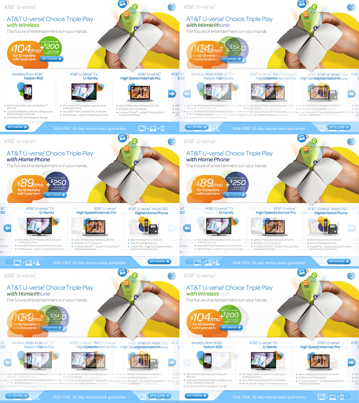
The expression “save a fortune” is noting special. For this concept, we liked the idea of “fortune” generally, and the nostalgia of those little paper fortune tellers worked well with AT&T brand at that time.
Knowing we were making animated ads, we came up with a simple presentation that played off that idea.
Paid to Perform
If the .com or landing page itself has its own appeal, be it from an entertainment perspective or some other tactic, the page has the potential to earn organic traffic.
In a campaign like this, the landing page was built like matching luggage, where there is paid media tied to a corresponding landing page and the creative can run along competing creative allowing testing to be done to see which performs the best.
Virginia & Brightwood College Pitch
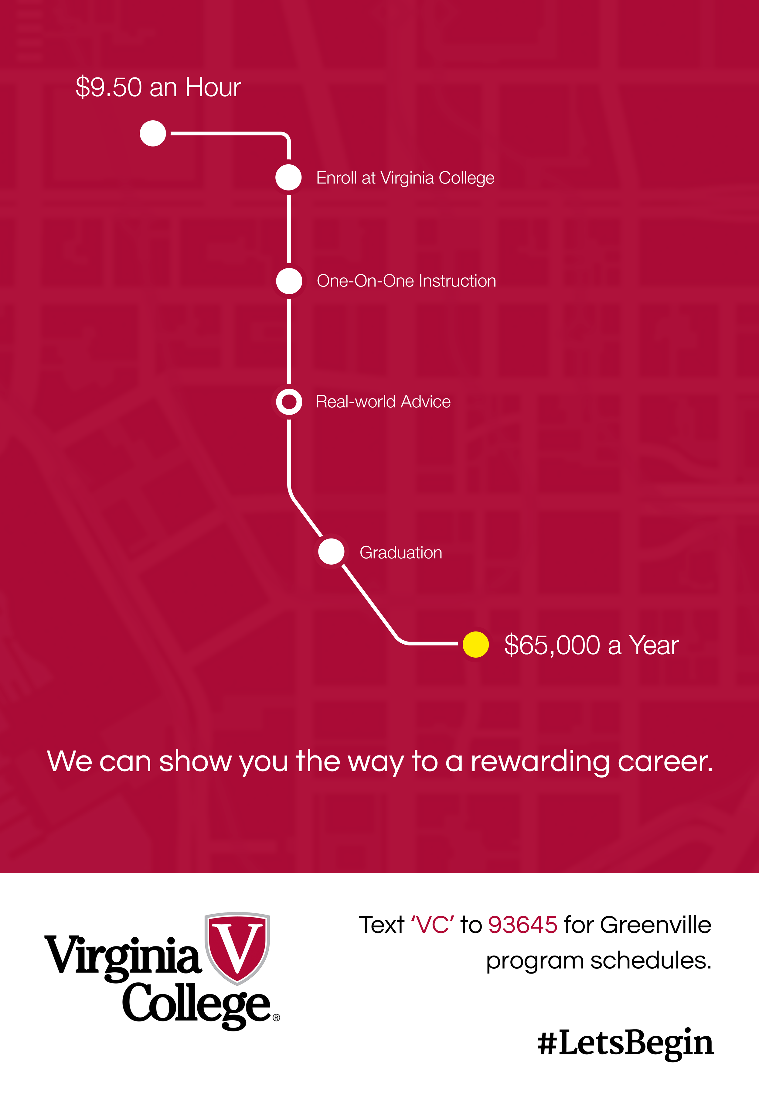
This work was done quickly as part of a pitch. It was just a small team and I was the lead designer. What I like about it is the 360° approach to the messaging.
They passed for a less expensive agency bid. Maybe should have sprung for Razorfish, though… They did go out of business in 2018.


